RideNote
From concept to a live App Store release in 30 days: a local-first iOS app that beta riders call smooth and premium.
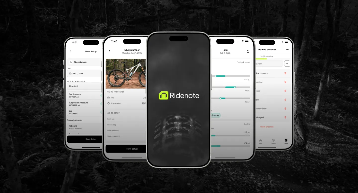
Mountain bikers forget which bike setup actually worked, and the existing tools are either too technical or too generic.
RideNote, a local-first iOS app for logging settings and rating every ride on Grip, Feel, and Control. No accounts, no spinners, everything instant.
Live on the App Store 30 days after the first line of the PRD, with beta riders calling it smooth and premium.
Context
RideNote exists to answer one question in a parking lot: was it 26 or 28 PSI that felt better last month?
Mountain bikers adjust tyre pressure and suspension constantly, and then forget what worked. The existing options are either suspension-engineer spreadsheets or generic notes apps. Neither fits someone who just wants to remember a setting.
I designed, branded, and built it solo, end to end, to prove full product ownership in a real release context. Not a prototype.
The Problem
Solo Everything
Product design, development, brand, App Store prep. Every hat, every decision, no team to delegate to.
Scope Discipline
A long feature list that needed ruthless cutting. Social features, AI recommendations, maintenance tracking. All cut.
Timeline vs. Craft
Ship in 30 days while making it feel premium. Beta testers needed to say “smooth,” not “rough prototype.”
First App Store Submission
Never released an iOS app before. App Store Connect, TestFlight, review guidelines. All new territory.
My Role
Solo designer and developer. Product definition, UX, visual design, brand and iconography, React Native implementation, App Store submission, and beta programme.
Process
Planning: the PRD as a self-contract
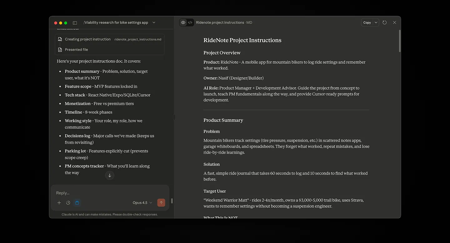
I started with a Product Requirements Document. Not a formality, a contract with myself to prevent feature creep.
The PRD defined success metrics, the user persona, and most importantly what I would not build. Every time I wanted to add something mid-build, I had to justify it against the document. Usually I couldn’t. Social sharing, AI recommendations, and Strava integration all went to Phase 2.
The persona was narrow on purpose: “Weekend Warrior Matt” rides 2-4 times a month on a trail bike, is comfortable with Strava, and has no intention of becoming a suspension engineer. He just wants to remember whether 26 or 28 PSI felt better.
Design and development in one loop
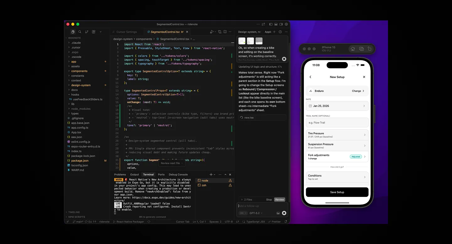
No wireframes, direct implementation. PRD-driven, built straight in Cursor. Unconventional, and it wouldn’t scale to a team that needs shared artifacts, but solo it meant I could iterate without handoff.
Boilerplate was easy. Judgement wasn’t. Cursor handled scaffolding and build debugging well. The harder part was collaboration: ask it to review a feature against the user story, or audit a flow, and you’d get a slightly different answer each time, even for the same kind of question. Rarely wrong outright, just inconsistent. The discipline was asking the right questions, then owning the final call myself regardless of what came back.
Mark, icon, type, and colour
Logo and app icon exploration, the type and colour system, and the iconography carried through to the App Store listing.
UX, UI, and build in one pass
The old process is sequential. Research, user story, flow, wireframe, high-fidelity UI, annotate, hand off, review loop. Building solo with an agent collapses that. UX and UI don’t happen on separate days, they happen in the same pass, because that’s how the agent generates them.
The pressure calculator is the clearest example. The brief was one line: give a rider a starting point from their weight, nothing else. The agent researched it, then built the flow, the UI, and the working feature together. My job was reviewing, testing, and feeding back on a loop until it was right. Three things came out of that loop I never designed as separate decisions: no tap needed to see a suggested value, an instant save, and a full snapshot of every setting at a glance. None of it was storyboarded in advance.
Edge cases surface on their own. Once a feature is clearly defined, modern agents tend to catch edge cases without being asked, and they’ll write and run their own tests if you ask them to. I log finished work in Linear and move on, one continuous cycle instead of a handoff chain.
Suggested pressure, saved instantly
The two claims above, as they actually render.
The trade-off is real. This kills the old way of batching focus by discipline. You’re not switching between a UX day and a UI day, you’re wearing every hat inside a single feature cycle. That’s most of the power of building this way, and most of the cost.
Key Decisions
Offline-first architecture
The most impactful technical decision was making RideNote completely local: no accounts, no cloud sync, pure SQLite on device.
Partly pragmatic (no backend to build), partly philosophical (instant saves, works with no signal on a trail, privacy by default). The trade-off, no cross-device sync, was acceptable for v1.
The payoff was immediate. Riders specifically called out how smooth it felt. No spinners, no network errors, no sign-up friction. When you’re in a parking lot logging settings before you forget, that speed is the product.
Baseline vs. ride note
Early versions conflated two things and confused people: bike configuration (what the hardware can do) and baseline settings (what you typically run).
I split them. Your baseline is your typical starting setup, stored once per bike. Ride notes are deviations from that baseline with performance feedback attached. Users understood immediately that they were tracking experiments, not maintaining a spec sheet.
What the hardware can do vs. what you run
The split described above, as it renders on a bike's own settings screen.
Three-dimensional feedback
Instead of one “how was the ride?” star rating, I used three sliders: Grip, Feel, and Control, each 1-5.
Tyre pressure affects grip differently than suspension affects comfort. A single rating loses that. Three sliders take about ten seconds. Fast enough not to feel like work, detailed enough to be useful months later.
Grip, Feel, Control
Purpose-built feedback a generic notes app can't offer.
Shipping
Beta testing
I tested with mountain biking friends first: informal conversations after rides, handing them my phone and watching. Early on I also added three things they asked for directly: a pre-ride checklist, free-form notes, and custom checklists.
Feedback was consistent: “works smooth,” “looks premium.” Testing also caught a language problem. Early versions used Strava-style “ride logging” language, but users weren’t logging rides, they were tracking setups. That framing shift made the app’s purpose clearer.
One concrete example of feedback changing the product: my adjustment ranges were too narrow. I’d scoped values around my own bike and a “typical” setup, and riders with different bikes or more extreme setups kept hitting the ceiling. Easy to miss when you only test on your own hardware, obvious the moment someone else tries to use it.
Building v2: what riders actually asked for
A working baseline to react to, not a blank page. I shipped v1 deliberately narrow, per the PRD-as-contract discipline above. Once real riders started using it, that discipline paid off differently.
Feedback came in directly, not through a formal process. WhatsApp messages and emails from riders I’d shared the app with on mountain biking forums, real users. The narrow adjustment ranges came up first, and kept coming up as the same pattern: small, specific friction that only showed once someone other than me was using it.
That pattern is what drove v2. Support for multiple bikes per rider. Wider, more complete adjustment fields (compression and rebound split into high-speed and low-speed, volume tokens, lockout modes). A pressure calculator suggesting a starting point from rider weight, discipline, and bike type. An insights view showing average Grip, Feel, and Control scores and the best-performing setup per bike. A proper pre-ride prep checklist. Full light and dark appearance support. Backup and CSV export.
None of it was in the original PRD. All of it came from watching real use, mine and other riders’, which is why the scope grew additively, in response to specific friction, not speculatively.
Craft debt got paid down too. Information architecture that grouped things confusingly in v1, and a visual pass to match iOS’s newer “liquid glass” slider styling, which meant an Expo SDK upgrade to get there. The app reads and feels considerably more premium than v1 did.
Three of the additions
None of it storyboarded before real riders hit real friction.
v2 is submitted and in App Store review now. Once it’s live, this is the first version I’ll actually promote, everything before this has been dogfooding and a small group of real riders, not a formal test panel.
Outcome
A recent snapshot, not a lifetime total. RideNote hasn't been promoted yet, this is organic and beta-community traffic ahead of the v2 launch, which is when real promotion starts.
Live in the App Store
Production iOS app, live and downloadable. Not a prototype, not a web app.
30-Day Build
From PRD to App Store approval in about 30 days of focused work, solo.
Beta Validation
“Smooth” and “premium” feedback. The baseline + experimentation model made sense to real riders.
Zero Backend
Offline-first meant no DevOps, no server costs, no auth headaches, and better UX.
Technical Implementation
Development
React Native / Expo / TypeScript
Data
SQLite / Local-first
AI Tools
Cursor AI / Claude / Perplexity
Design
Affinity Designer / Figma
Reflection
What worked. The PRD as a self-contract. Writing down what I would not build mattered as much as defining what I would. The offline-first decision compounded: faster development, better UX, simpler privacy story. Good architecture makes later decisions easier.
What I’d do differently. I waited until the app was “done” to get beta feedback. I should have shared rough builds far sooner. Early feedback would have caught the “ride logging” vs. “setup tracking” language problem weeks earlier. I also didn’t keep a decision log, which meant reconstructing context afterwards. And I mixed App Store prep with bug fixing; screenshots and copy need a different headspace than debugging.
What’s next. v2 is in App Store review now. Once it’s live, this is the first version I’ll actually promote, everything before this has been dogfooding and a small group of real riders, not a formal test panel. After that I want to give people time to live with the new version before I go looking for structured feedback again.
Android has real demand behind it and is already in testing on the Play Store. That’s overdue, and it’s next in line.
Beyond that, a few things are on the table and none of them are committed. Setup sharing between riders is the most requested, but I’m not convinced it fits the app’s original point, so I’ll test it small before building it out properly. Strava integration is the one I actually want, but it adds real complexity and possibly a cost I’d have to pass on somehow, which means thinking about monetisation, something I’m not eager to do for what’s still a free, personal project. And there’s a bigger, separate idea sitting behind all of it: bike fleet management, which could open into a web app for bike shops managing their riders’ bikes. That one’s further out, and it’s the kind of thing I’d want real appetite for before committing to it.
Want something like this for your business?
One person from brief to working product. Clear scope, honest timeline, and a fixed price after a free 30-minute call.