Kota AI
An AI operations workspace for South African SMEs, designed and built end to end, solo, now in pre-launch beta.
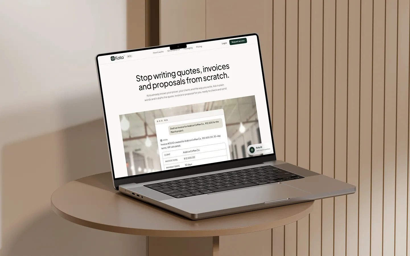
SME owners lose momentum to admin. Quotes go out late, invoices sit unsent, and every tool needs the business explained to it again.
An AI workspace that already knows the business and turns plain language into usable output: invoices, proposals, follow-ups, next actions.
A working multi-agent product in pre-launch beta, designed in code and built solo, with reliability favoured over AI theatrics.
Project Overview
Kota started from a problem I understood first-hand: small business owners do not need another tool that gives them one more place to type, configure, or manage work. They need help getting operational tasks out of their heads and into finished outputs.
For many South African service businesses, the drag is not the core work. It is everything around it. Quotes go out late. Invoices sit unsent. Follow-ups slip. Proposals get rewritten from scratch. Context lives across memory, WhatsApp threads, notes, and half-finished documents. Most tools treat these as separate workflows. In reality, they are all part of the same operational burden.
Kota was my attempt to design a system around that burden. The goal was to create a workspace that understands the business context, then turns intent into usable output, whether that output is an invoice, a proposal, a follow-up draft, or the next best action.
Tools & Technologies
Build Workflow
OpenAI Codex / Cursor / Claude Code
Backend
Python / FastAPI / LangGraph / SSE streaming
Data
Supabase / PostgreSQL / RLS
Frontend
Astro / React Islands / TypeScript
Design
Affinity Designer / Design in code
Testing & Review
Playwright / Refactoring passes / Security review
The Problem
Three recurring failures shaped the product.
Admin breaks momentum. In many small service businesses, the same person doing the work is also writing the quote, sending the invoice, chasing payment, and following up on leads. Important tasks do not fail because they are hard. They fail because they arrive at the wrong time, with too much friction.
Operational context does not compound. A proposal does not know your service pricing. A draft message does not know your tone. A quote does not know your VAT status. The business has to keep re-explaining itself.
AI often adds another layer instead of removing one. A generic assistant can answer questions, but that is not the same as helping a business move work forward. In this category, a paragraph is rarely enough. The output needs to become a usable artifact.
That became the central design question for the product:
What does an AI product look like when it is designed around operational follow-through rather than conversational novelty?
The Solution
Kota is an AI-powered operations workspace built for South African SMEs, especially service businesses where the owner is both the operator and the back office.
The product combines client context, financial documents, follow-up drafting, tasks, business memory, and compliance-aware assistance into one system. Instead of returning text by default, it returns the right working format for the job: a document, a table, an action state, or a structured draft.
The interaction model is intentionally simple:
- ask in plain language
- get a usable output back
- review before anything important happens
That principle shaped both the UX and the architecture. From a product perspective, Kota is not meant to feel like an AI novelty layer on top of business software. It is meant to feel like operational support that already knows the business and can help complete work with less setup, less repetition, and less context switching.
My Approach
I did not design this in Figma first.
The product was developed almost entirely through AI-assisted coding workflows using OpenAI Codex, Cursor, and Claude Code. Branding and visual design assets were created in Affinity, but the actual product design process happened inside the build.
The working method was closer to product discovery through making than traditional handoff design.
I would identify a problem, define the feature set that might solve it, turn that into user stories, and then build directly against those stories. From there, the loop was always the same:
build, test, reduce, iterate
I went wide early. I explored a larger feature surface than the final product needed. Then I kept cutting. If a flow introduced too much friction, it was simplified. If a feature felt impressive but did not meaningfully improve the task, it was reduced or removed. If performance or complexity became a bottleneck, I changed the technical approach.
This gave the project a double-diamond rhythm in practice:
- identify the operational problem
- expand into possible solutions
- reduce toward the most useful interaction
- rebuild with less friction
AI also shaped how the product was made. I used different tools, plugins, and skills for different phases of the loop. Design exploration, refactoring, security review, and browser testing each had their own passes. That let me move unusually fast, but it also meant the real discipline was not generation. It was reduction.
Product Design Thinking
The strongest product decision in Kota was not technical. It was deciding that the product should be designed around finished operational outcomes rather than assistance alone.
That led to a few core choices:
The system should return work, not just answers. If a user asks for an invoice, the useful result is not a paragraph about invoicing. It is an invoice draft they can review and send.
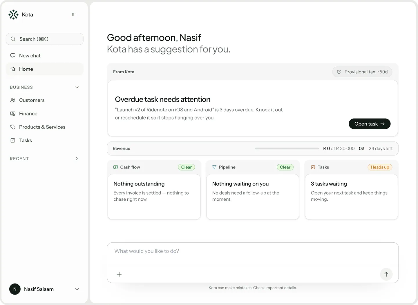
Business context should compound quietly. The system should remember the business name, tone, pricing, payment terms, services, and compliance posture so the user does not have to restate them.
Human review should stay visible. Anything sensitive or mutating should remain explicit. The product should feel active, but never reckless.
Surface context matters. A follow-up request inside communications is not the same as one inside finance. The system should feel aware of the room the user is in.
Reliability matters more than theatrics. Where a deterministic system is better than an agentic one, the deterministic system should win.
Those decisions gave the app its shape. The UX is chat-led, but not chat-only. The AI is central, but not unbounded. The product aims to reduce operational drag without turning the experience into a black box.
AI Architecture
Under the interface, Kota uses a small multi-agent system rather than one general assistant.
The architecture is intentionally narrow. Instead of creating many agents for every surface, I kept the system to a few specialized roles:
- a router to classify intent
- a general agent for single-step operational tasks
- a workflow agent for more complex multi-step outputs
- a South African compliance specialist for regulatory questions
This was a product decision as much as a systems decision. Separate agents only make sense when the reasoning pattern is meaningfully different. Otherwise, complexity grows faster than usefulness.
The other important architectural decision was the Generative UI contract. The agent does not generate arbitrary interface code. It returns typed structured responses, and the frontend renders the appropriate component. That allowed the UX to feel purposeful rather than chat-shaped by default.
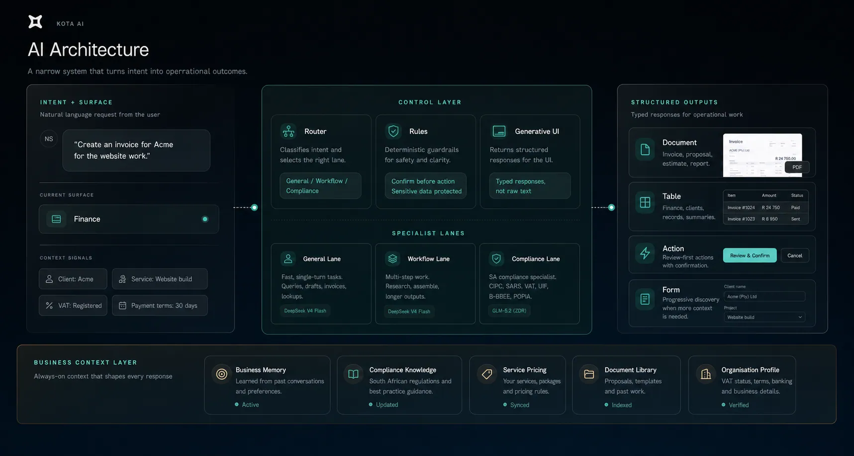
The architecture supports the product in three ways:
- it keeps simpler requests fast
- it allows richer outputs when deeper workflows are needed
- it keeps behavior more predictable and debuggable
The system design became a way to protect the interaction quality.
UX Journey: Creating an Invoice
This is one of the clearest examples of how the product is meant to work.
The user does not begin by navigating a complex finance flow and filling out a blank form. They begin with intent.
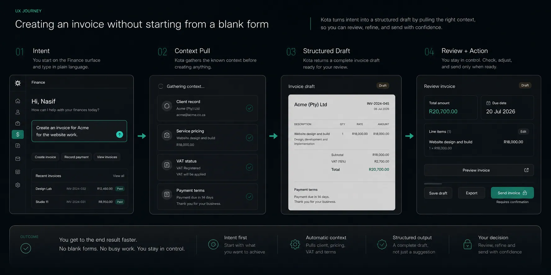
The UX goal here was to collapse friction, not hide process. The user still remains in control, but the blank-page problem is removed.
Core Features
I deliberately kept the case study focused on a few behaviors rather than trying to document every feature in the product.
Operational document creation
Users can generate invoices, quotes, estimates, and proposals from natural language, with business context already applied.
Business-aware drafting
Messages, follow-ups, and document language are shaped by saved services, tone, pricing, and other business context.
Structured AI output
Responses are rendered as usable UI states rather than generic text whenever the task calls for it.
South African context built in
The product is designed around ZAR, VAT, EFT workflows, local compliance language, and South African SME realities from the start.
Review-first actions
The system supports action, but not hidden action. Important changes remain visible and user-controlled.
Outcome To Date
Kota has advanced from an architecture-led concept into a much more resolved product system.
The most valuable part of the project for me is not just that I built a multi-agent product solo. It is that the product thinking held up through implementation. The more I built and tested, the more the same conclusion kept proving true: small business users do not want more software to manage. They want less friction between intention and completed work.
Product Thinking Led
The case study is centered on reducing admin friction and turning user intent into usable output rather than showcasing AI novelty for its own sake.
Designed In Code
The product was shaped through direct building, testing, trimming, and iterating with AI-assisted tools instead of a traditional Figma-first process.
System Design In Service Of UX
The multi-agent architecture, structured responses, and deterministic rules all exist to support clearer workflows and more trustworthy interactions.
Market-Specific Execution
South African business realities like VAT, EFT, compliance language, and operational habits were designed in from the start rather than added later.
Kota became a strong proof point for how I work: product thinking first, system design second, and implementation close enough to the problem that the design can keep evolving as the product proves itself.
Now in beta testing
Currently being tested and refined with real South African service businesses. The product is live and early access is underway.
Want something like this for your business?
One person from brief to working product. Clear scope, honest timeline, and a fixed price after a free 30-minute call.