Banking Platform: Creative Direction Across Three Surfaces
Creative direction across a bank's public site, secure platform, and mobile app, shipped in 2023 and still live today.
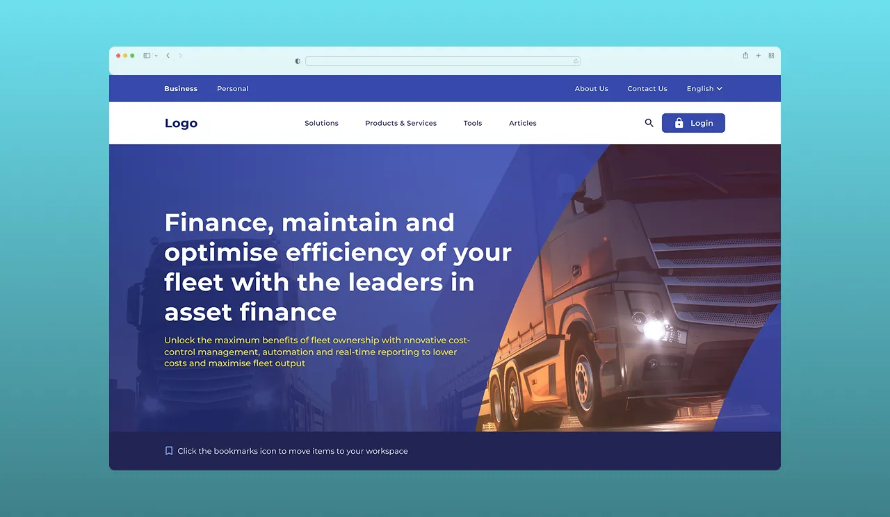
A smaller South African bank looked dated next to FNB and Capitec, and an offshore team's experimental direction didn't fit how local customers judge a bank.
A competing creative direction grounded in local market research, then UI delivery across public web, secure platform, and mobile with an external dev team.
My direction was selected over the offshore team's. The public site launched in 2023 and is still live, unredesigned, three years on.
Companion case study: this piece covers creative direction and cross-platform delivery. The underlying component architecture, tokens, and governance model are covered separately in Enterprise Design System.
NDA note: this is an NDA-protected project. The process described is real; visuals are representative and specific figures are generalised.
Context
A mid-sized South African bank was losing ground to competitors with sharper digital products. Their public site, secure banking platform, and mobile app had each been built at different times by different teams, so a customer moving between them effectively met three different banks.
I joined mid-2022 as lead UI designer. An offshore design team was already three directions deep into a concept exploration.
The Problem
Three Disconnected Surfaces
Login, onboarding, forms, and dashboards each used different UI patterns. Customers crossing from the public site into the secure platform hit a visible seam.
A Direction That Didn't Fit
The offshore team’s concepts leaned experimental. In retail banking, novelty reads as risk, especially for a challenger brand that still has to prove it is safe to hold your money.
Competitive Pressure
The bank had to close the gap with FNB, ABSA, and Capitec locally, while meeting the expectations set internationally by Wells Fargo, Citibank, and Amex.
Delivery Through Others
Nothing shipped through my hands. An external team of 6-10 developers, including a Flutter specialist, built everything, so the design had to survive translation.
My Role
I owned creative direction and UI design across all three surfaces. Specifically, I:
- ran the competitive research that reframed the design direction
- pitched and won the creative direction against the incumbent offshore proposal
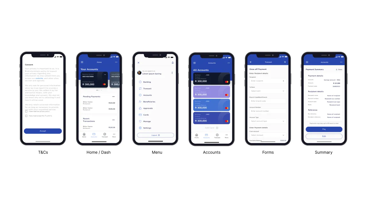
- designed the UI for public web, secure platform, and mobile
- worked directly with the external dev team, project managers, and the Flutter developer through build
- presented a token-based handoff model to engineering before Figma shipped variables
Process
1. Reframing the problem through competitive research
Rather than argue taste against the offshore team, I went and got evidence. I ran a structured teardown of local banks (FNB, ABSA, Capitec) and international leaders (Wells Fargo, Citibank, American Express, Scotiabank), looking specifically at how each one signals trust: density of information, conservatism of colour, how prominently security is stated, how onboarding paces itself.
The pattern was consistent. South African users read restraint as credibility. The offshore direction was optimising for distinctiveness in a category where distinctiveness is a liability.
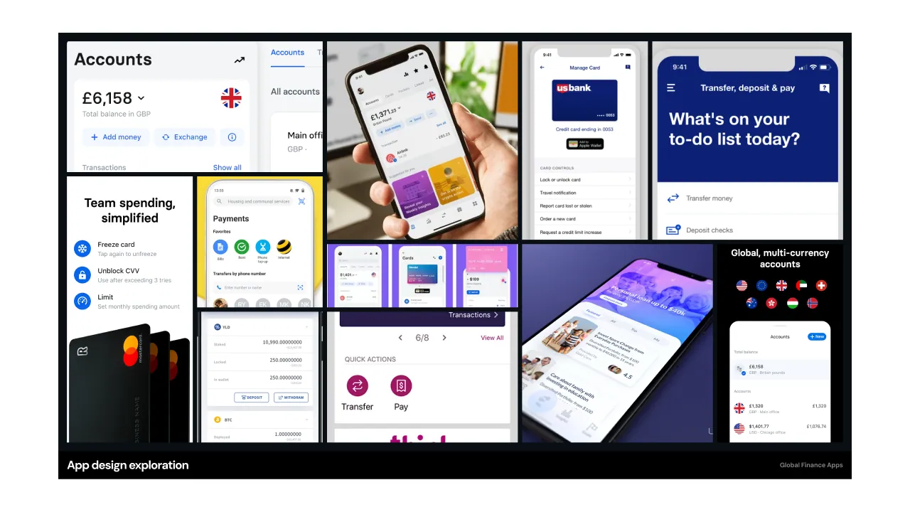
That research is why my direction was selected. It won on the strength of the argument, not the visuals alone.
2. Designing across three surfaces
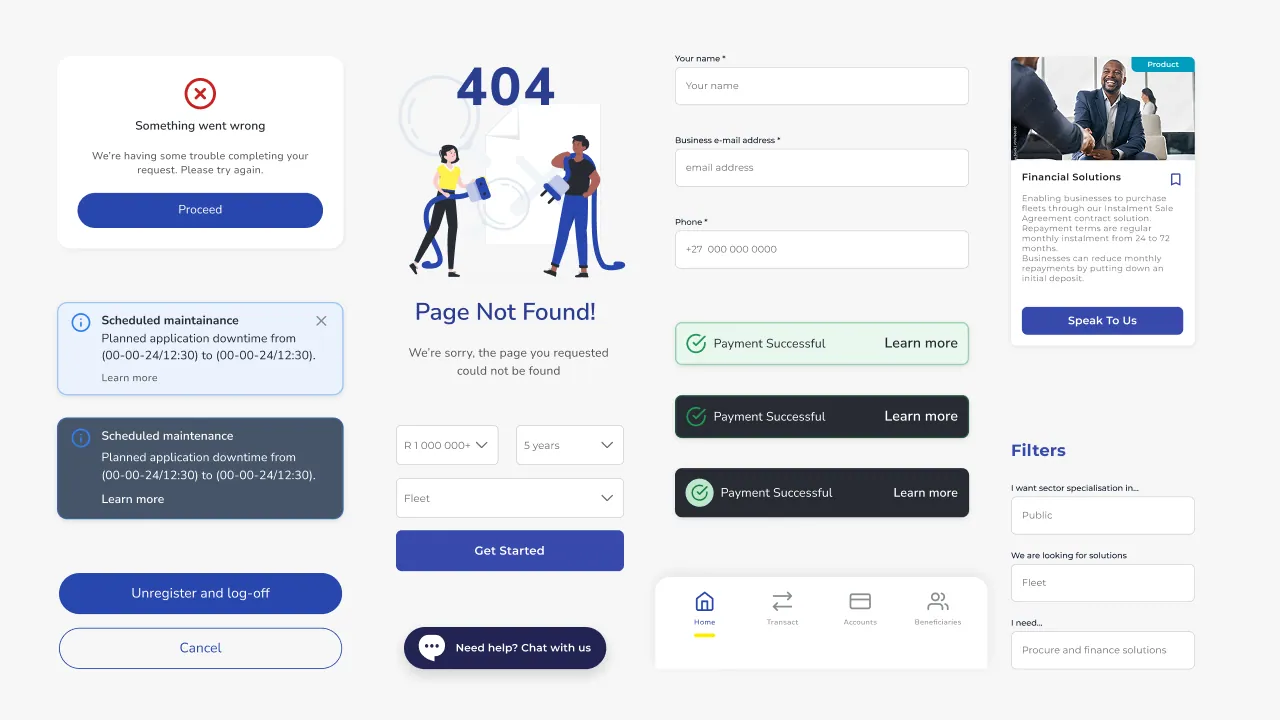
I built the UI on Material Design 2 for web and adapted Material 3 principles for mobile: M2 for the robustness and maturity a bank needs, M3 for the mobile patterns users now expect. The work was keeping these coherent without maintaining two disconnected systems.
3. Making the handoff survivable
With an external team building everything, I treated handoff as a design problem. I presented a token-based system to engineering before Figma had variables, which proved too early for the team to adopt wholesale, so I adapted it into a naming and spec convention they could actually execute against.
I also built a notification framework: a single set of rules for how the bank communicates state, errors, and confirmations, so those decisions stopped being remade per screen.
Key Decisions
Restraint over distinctiveness. In a category where customers are scanning for reasons to distrust you, conventional patterns outperform novel ones. I argued this with research rather than preference.
Material 2 for web, Material 3 for mobile. An unusual split, chosen deliberately: M2’s maturity suited the risk profile of secure banking surfaces, M3 matched what mobile users already expected. The cost was a coherence problem I had to solve manually.
Adapt the token model rather than insist on it. The full token system was ahead of what the team could implement. Shipping a simplified version that engineers would actually use beat being right about the better one.
Outcome
Direction Selected
My creative direction was chosen over the incumbent offshore team’s, on the strength of the market research behind it.
Live Since 2023
The public-facing site launched in 2023 and remains live today, three years on, without a redesign.
Three Surfaces Unified
Public web, secure platform, and mobile shipped on one visual and interaction language, closing the seams customers used to hit.
Frameworks That Outlived Me
The notification framework and spec conventions stayed in use by the dev team after my involvement ended.
Technical Implementation
Design System
Material Design 2 (Web) / Material Design 3 (Mobile)
Platforms
Public Web / Secure Web / Mobile App (Flutter)
Role
Creative Direction / UI Lead / Design Ops
Collaboration
External Dev Team / Design Token Handoff
Reflection
What worked. Leading with research instead of taste is why I won the direction. In an environment where a client is weighing two agencies, the argument is the deliverable.
What I’d do differently. I presented the token system at the level I wanted it to exist, not the level the team could adopt. I’d now pitch the version people can use on Monday, and keep the ambitious one as the roadmap.
What I’d want to measure. I shipped without instrumentation for design outcomes. If I ran this again I’d agree success metrics with the bank up front: onboarding completion, support contact rate, task success, so the work could be defended in numbers rather than adjectives.
Want something like this for your business?
One person from brief to working product. Clear scope, honest timeline, and a fixed price after a free 30-minute call.