Enterprise Design System
A production design system for a financial institution, giving distributed teams one shared UI foundation across web and mobile.
Distributed teams at a financial institution were rebuilding the same UI differently on every project, with no shared foundation.
A reusable design system: components, patterns, and documentation architected for both web and mobile delivery.
A unified experience across platforms and faster implementation for every team that builds on it.
Project Overview
Problem: a financial institution needed consistency across multiple digital products without slowing teams down.
Role: senior UI designer focused on system architecture, components, and documentation.
What I delivered: a reusable design system covering web and mobile patterns, documentation, and implementation guidance for distributed teams.
Why it mattered: the system had to support scale, speed, and consistency at the same time.
Proof: it gave teams a shared foundation for cross-platform product delivery in a high-trust context.
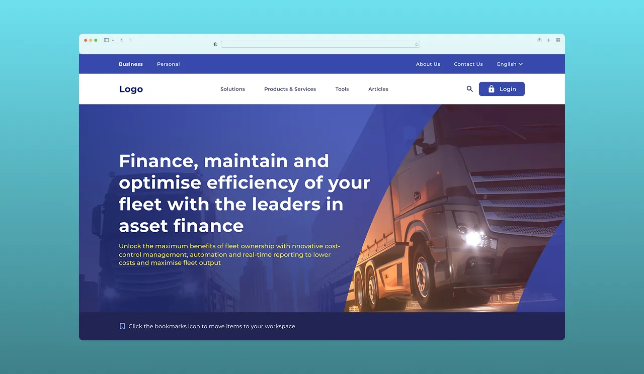
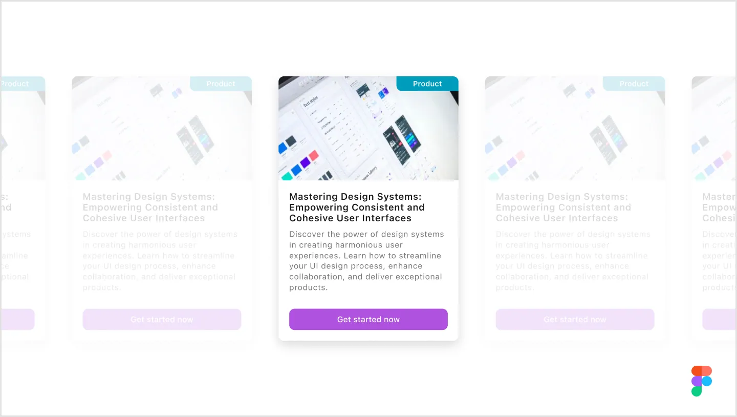
NDA note: This is an NDA-protected project. The processes described are real, but visuals are representative.
The Challenge
Multiple Products Different digital products with unique requirements needed a unified design language while maintaining flexibility for specific needs.
Platform Diversity Web, mobile, and secure platforms each required specific adaptations while maintaining brand consistency and user experience.
Scale & Speed Rapid development needs required efficient, scalable design solutions without compromising quality or consistency.
Team Distribution Teams across different departments and functions needed a unified design system to ensure consistency and collaboration.
Role & Responsibilities
I led design system architecture and implementation, creating and maintaining component libraries while developing comprehensive documentation. I supported development teams throughout the process, collaborated with developers to ensure alignment, and established design standards and guidelines that would scale across the organization.
Process & Approach
Foundation Building
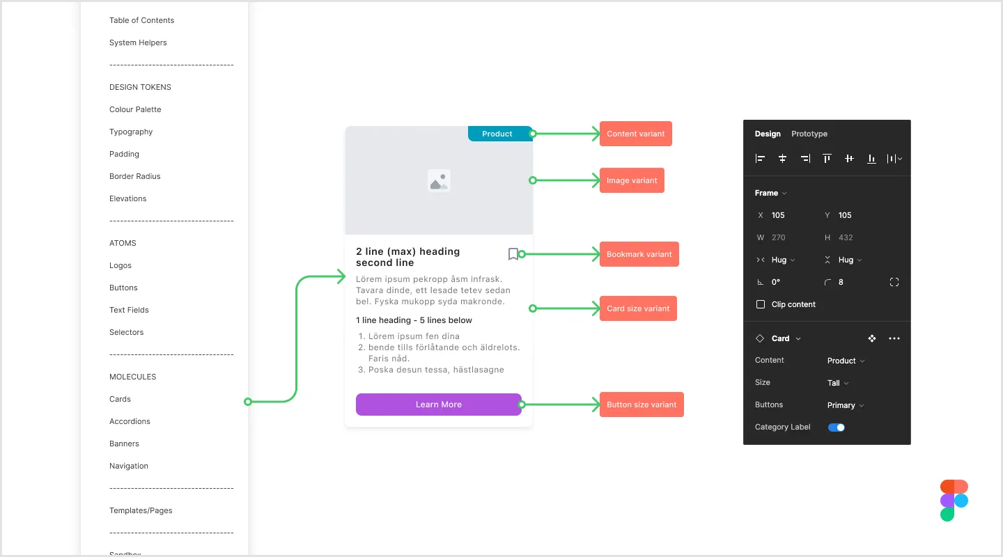
The foundation of our design system was built on proven methodologies and best practices. I implemented a scalable architecture using atomic design principles with atoms, molecules, and organisms to ensure modularity. I created a comprehensive set of design tokens for colors, typography, and spacing to enable theming across platforms. The base components I developed served as building blocks for more complex patterns. Throughout this phase, I established clear naming conventions, usage guidelines, and documentation requirements that would make the system accessible to teams across the organization.
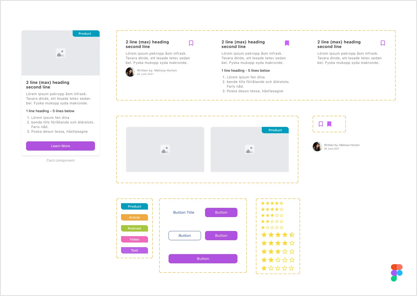
Component Development
Our component development process focused on creating a versatile and maintainable library. I built an extensive library of reusable components that could be combined in countless ways. Each component was designed with responsive principles, creating flexible layouts that adapt seamlessly to different screen sizes. The system was built with scalability in mind, allowing it to be easily extended or modified as new requirements emerged without breaking existing implementations.
Platform Adaptation
We carefully adapted the system for different platforms while maintaining consistency. For mobile, I adapted designs to better suit the Flutter framework, accounting for its specific constraints and capabilities. I developed a notification framework to guide cross-functional teams in implementing consistent communication patterns across all touchpoints. Core aspects of the system were designed with flexibility in mind, allowing them to work effectively across different platforms while maintaining the essential brand characteristics.
Results & Impact
Unified Design Achieved consistent brand experience across all digital platforms, resulting in improved brand recognition and trust.
Development Speed Faster implementation of new features through standardized components and clear documentation.
Quality Improvement Reduction in design time through pre-built components and clear documentation.
Team Efficiency Significantly improved collaboration and reduced decision-making time across distributed teams.
Technical Implementation
Methodology
Atomic Design / Design Tokens
Tools
Figma / Documentation Platform
Frameworks
React (Web) / Flutter (Mobile)
Deliverables
Component Library / Usage Guidelines
Key Learnings
- Early developer collaboration is crucial for successful implementation. I learned that involving engineers from the beginning prevents downstream issues and ensures the system actually works in code, not just in design files.
- Systematic documentation proved as important as the design itself. Without clear guidelines and examples, even the best components won’t be used correctly.
- Regular feedback loops ensured system relevance and adoption. I maintained constant communication with teams using the system to understand pain points and opportunities for improvement.
- The balance between flexibility and consistency is key. Too rigid and teams can’t solve unique problems. Too flexible and consistency breaks down.
- Insights into development frameworks are invaluable. Understanding React and Flutter constraints informed better design decisions from the start.
- I also learned to leverage leading design systems and trends as a foundation, adapting proven patterns rather than reinventing everything from scratch.
Want something like this for your business?
One person from brief to working product. Clear scope, honest timeline, and a fixed price after a free 30-minute call.